Non-diffusive atmospheric flow #8: flow pattern distribution
Up to this point, all the analysis that we’ve done has been what might be called “normal”, or “pedestrian” (or even “boring”). In climate data analysis, you almost always need to do some sort of spatial and temporal subsetting and you very often do some sort of anomaly processing. And everyone does PCA! So there’s not really been anything to get excited about yet.
Now that we have our PCA-transformed anomalies though, we can start to do some more interesting things. In this article, we’re going to look at how we can use the new representation of atmospheric flow patterns offered by the PCA eigenpatterns to reduce the dimensionality of our data, making it much easier to handle. We’ll then look at our data in an interesting geometrical way that allows us to focus on the patterns of flow while ignoring the strengths of different flows, i.e. we’ll be treating strong and weak blocking events as being the same, and strong and weak “normal” flow patterns as being the same. This simplification of things will allow us to do some statistics with our data to get an idea of whether there are statistically significant (in a sense we’ll define) flow patterns visible in our data.
Dimensionality reduction by projection to a sphere
First let’s think about how we might use the PCA-transformed data we generated in the previous article — we know that the PCA eigenpatterns are the anomaly patterns that explain the biggest fraction of the total anomaly variance: the first PCA eigenpattern is the pattern with the biggest variance, the second is the pattern orthogonal to the first with the biggest variance, the third is the pattern orthogonal to the first two patterns with the biggest variance, and so on.
In order to go from the 72 × 15 = 1080-dimensional anomaly data to something that’s easier to handle, both in terms of manipulation and in terms of visualisation, we’re going to take the seemingly radical step of discarding everything but the first three PCA eigenpatterns. Why three? Well, for one thing, three dimensions is about all we can hope to visualise. The first three PCA eigenpatterns respectively explain 8.86%, 7.46% and 6.27% of the total anomaly variance, for a total of 22.59%. That doesn’t sound like a very large fraction of the overall variance, but it’s important to remember that we’re interested in large-scale features of the flow here, and most of the variance in the later PCA eigenpatterns is small-scale “weather”, which we’d like to suppress from our analysis anyway.
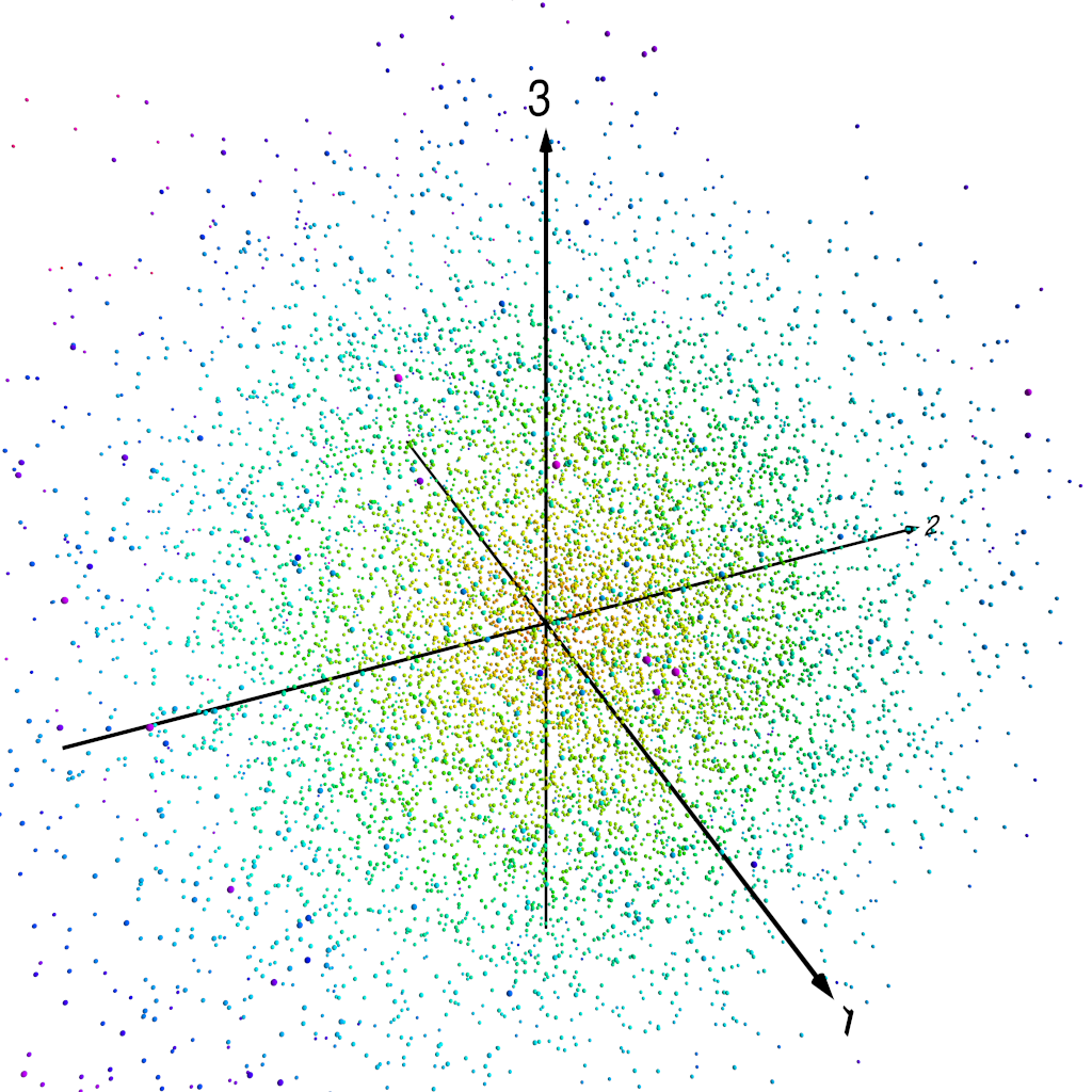
Let’s make it quite clear what we’re doing here. At each time step, we have a 72 × 15 map of anomaly values. We transform this map into the PCA basis, which doesn’t lose any information, but then we truncate the vector of PCA projected components, retaining only the first three. So instead of having 72 × 15 = 1080 numbers (i.e. the individual grid-point anomaly values), we have just three numbers, the first three PCA projected components for the time step. We can thus think of our reduced dimensionality anomaly “map” as a point in three-dimensional space.
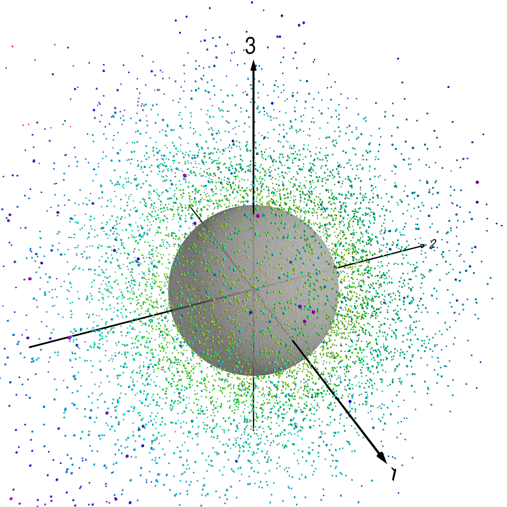
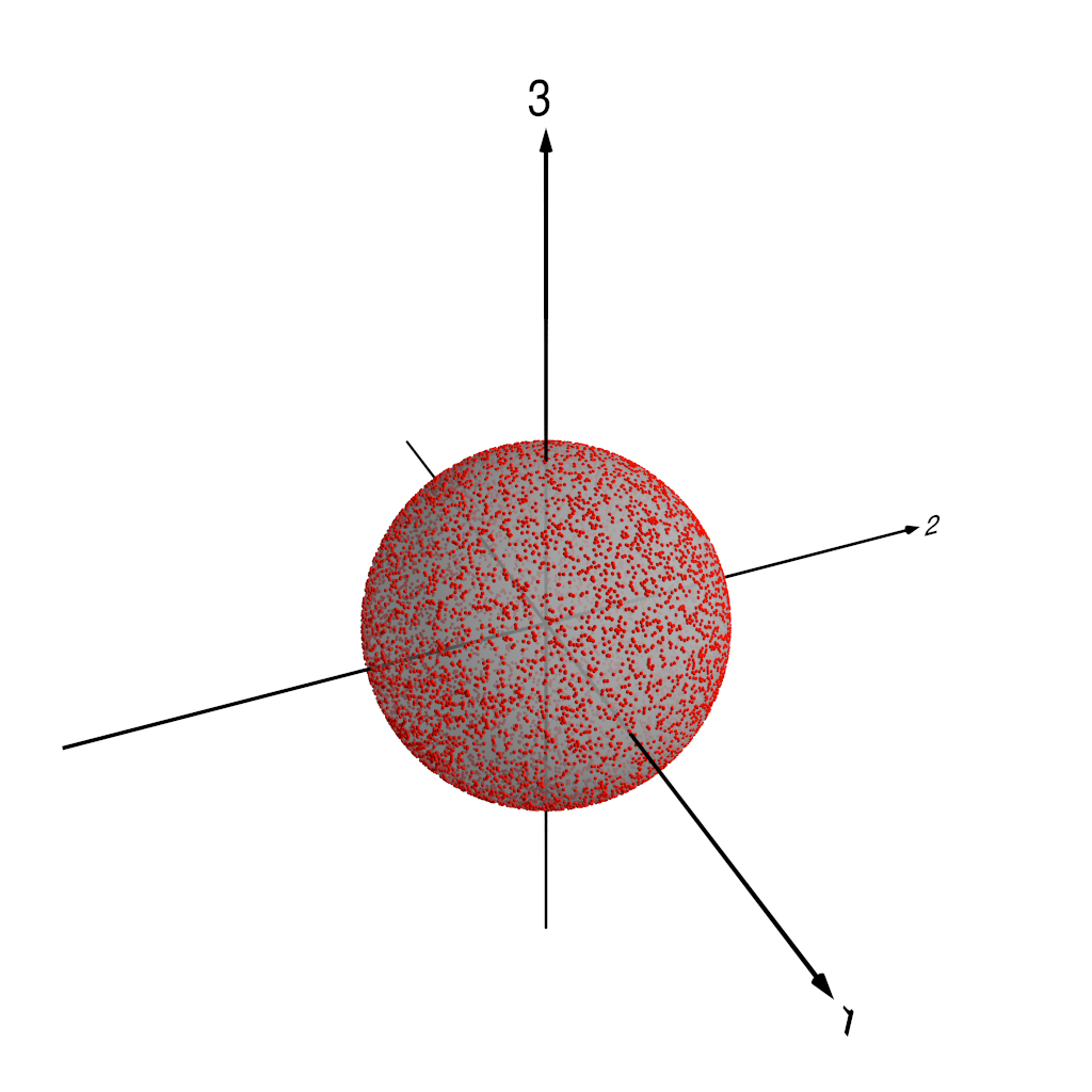
Three dimensions is still a little tricky to visualise, so we’re going to do something slightly sneaky. We’re going to take the data points in the three-dimensional space spanned by the first three PCA components, and we’re going to project those three-dimensional points onto the unit sphere. This yields two-dimensional points that we can represent by standard polar coordinates — if we think of a coordinate system where the x-, y- and z-axes lie respectively along the directions of the , and components in our three-dimensional space, then the standard colatitude and longitude are suitable coordinates to represent our data points. Because there’s real potential for confusion here, I’m going to be careful from now on to talk about coordinates on this “PCA projection sphere” only as or , reserving the words “latitude” and “longitude” for spatial points on the real Earth in the original data.
The following figures show how this works. Figure 1 shows our three-dimensional points, colour coded by distance from the origin. In fact, we normalise each of the PC components by the standard deviation of the whole set of PC component values — recall that we are using normalised PCA eigenpatterns here, so that the PCA projected component time series carry the units of . That means that for the purposes of looking at patterns of variability, it makes sense to normalise the projected component time series somehow. Figure 2 shows the three-dimensional points with the unit sphere in this three-dimensional space, and Figure 3 shows each of the original three-dimensional points projected onto this unit sphere. We can then represent each pattern as a point on this sphere, parameterised by and , the angular components of the usual spherical coordinates in this three-dimensional space.
Kernel density estimation
Once we’ve projected our PCA data onto the unit sphere as described above, we can look at the distribution of data points in terms of the polar coordinates and :
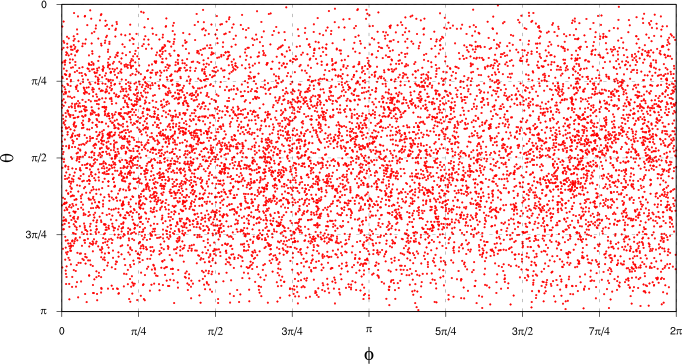
Note that we’re doing two kinds of projection here: first we’re transforming the original data (a time series of spatial maps) to the PCA basis (a time series of PCA projected components, along with the PCA eigenpatterns), then we’re taking the first three PCA components, normalising them and projecting to the unit sphere in the space spanned by the first three PCA eigenpatterns. Each point in the plot above thus represents a single spatial configuration of at a single point in time.
Looking at this plot, it’s not all that clear whether there exist spatial patterns of that are more common than others. There’s definitely some clustering of points in some areas of the plot, but it’s quite hard to assess because of the distortion introduced by plotting the spherical points on this kind of rectangular plot. What we’d really like is a continuous probability distribution where we can see regions of higher density of points as “bumps” in the distribution.
We’re going to use a method called kernel density estimation (KDE) to get at such a continuous distribution. As well as being better for plotting and identifying interesting patterns in the data, this will also turn out to give us a convenient route to use to determine the statistical significance of the “bumps” that we find.
We’ll start by looking at how KDE works in a simple one-dimensional case. Then we’ll write some Haskell code to do KDE on the two-dimensional sphere onto which we’ve projected our data. This is a slightly unusual use of KDE, but it turns out not to be much harder to do that the more “normal” cases.
The basic idea of KDE is pretty simple to explain. Suppose we have a sample of one-dimensional data points for . We can think of this sample as defining a probability distribution for x as
where is the usual Dirac -function. What (1) is saying is that our data defines a PDF with a little probability mass (of weight 1/N) concentrated at each data point. In kernel density estimation, all that we do is to replace the function by a kernel function K(x), where we require that
The intuition here is pretty clear: the -functions in (1) imply that our knowledge of the is perfect, so replacing the -functions with a “smeared out” kernel K(x) represents a lack of perfect knowledge of the . This has the effect of smoothing the “spikey” -function to give something closer to a continuous probability density function.
This is (of course!) a gross simplification. Density estimation is a complicated subject — if you’re interested in the details, the (very interesting) book by Bernard Silverman is required reading.
So, we’re going to estimate a probability density function as
which raises the fundamental question of what to use for the kernel, K(x)? This is more or less the whole content of the field of density estimation. We’re not going to spend a lot of time talking about the possible choices here because that would take us a bit off track, but what we have to choose basically comes down to two factors: what shape is the kernel and how “wide” is it?
A natural choice for the kernel in one-dimensional problems might be a Gaussian PDF, so that we would estimate our PDF as
where is a Gaussian PDF with mean and standard deviation . Here, the standard deviation measures how “wide” the kernel is. In general, people talk about the “bandwidth” of a kernel, and usually write a kernel as something like K(x; h), where h is the bandwidth (which means something different for different types of kernel, but is generally supposed to be some sort of measure of how spread out the kernel is). In fact, in most cases, it turns out to be better (for various reasons: see Silverman’s book for the details) to choose a kernel with compact support. We’re going to use something called the Epanechnikov kernel:
where u = x / h and is the indicator function for , i.e. a function that is one for all points where and zero for all other points (this just ensures that our kernel has compact support and is everywhere non-negative).
This figure shows how KDE works in practice in a simple one-dimensional case:

We randomly sample ten points from the range [1, 9] (red impulses in the figure) and use an Epanechnikov kernel with bandwidth h = 2 centred around each of the sample points. Summing the contributions from each of the kernels gives the thick black curve as an estimate of the probability density function from which the sample points were drawn.
The Haskell code to generate the data from which the figure is drawn looks like this (as usual, the code is in a Gist):
module Main where

import Prelude hiding (enumFromThenTo, length, map, mapM_, replicate, zipWith)
import Data.Vector hiding ((++))
import System.Random
import System.IO

-- Number of sample points.
n :: Int
n = 10

-- Kernel bandwidth.
h :: Double
h = 2.0

-- Ranges for data generation and output.
xgenmin, xgenmax, xmin, xmax :: Double
xgenmin = 1 ; xgenmax = 9
xmin = xgenmin - h ; xmax = xgenmax + h

-- Output step.
dx :: Double
dx = 0.01

main :: IO ()
main = do
  -- Generate sample points.
  samplexs <- replicateM n $ randomRIO (xgenmin, xgenmax)
  withFile "xs.dat" WriteMode $ \h -> forM_ samplexs (hPutStrLn h . show)
  let outxs = enumFromThenTo xmin (xmin + dx) xmax
      -- Calculate values for a single kernel.
      doone n h xs x0 = map (/ (fromIntegral n)) $ map (kernel h x0) xs
      -- Kernels for all sample points.
      kernels = map (doone n h outxs) samplexs
      -- Combined density estimate.
      pdf = foldl1' (zipWith (+)) kernels
      pr h x s = hPutStrLn h $ (show x) ++ " " ++ (show s)
      kpr h k = do
        zipWithM_ (pr h) outxs k
        hPutStrLn h ""
  withFile "kernels.dat" WriteMode $ \h -> mapM_ (kpr h) kernels
  withFile "kde.dat" WriteMode $ \h -> zipWithM_ (pr h) outxs pdf

-- Epanechnikov kernel.
kernel :: Double -> Double -> Double -> Double
kernel h x0 x
  | abs u <= 1 = 0.75 * (1 - u^2)
  | otherwise = 0
  where u = (x - x0) / h
The density estimation part of the code is basically a direct
transcription of (2) and (3) into Haskell. We have to choose a
resolution at which we want to output samples from the PDF (the value
dx in the code) and we have to use that to generate x values
to output the PDF (outxs in the code), but once we’ve done
that, it’s just a matter of calculating the values of kernels centred
on our random sample points for each of the output points, then
combining the kernels to get the final density estimate. We’re going
to do essentially the same thing in our spherical PDF case, although
we have to think a little bit about the geometry of the problem, since
we’re going to need a two-dimensional version of the Epanechnikov
kernel on the unit sphere to replace (3). That’s just a detail
though, and conceptually the calculation we’re going to do is
identical to the one-dimensional example.
Calculating and visualising the spherical PDF
The code to calculate our spherical PDF using kernel density estimation is in the linked file. We follow essentially the same approach that we used in the one-dimensional case described above, except that we use a two-dimensional Epanechnikov kernel defined in terms of angular distances between points on the unit sphere. We calculate PDF values on a grid of points , where i and j label the and coordinate directions of our grid on the unit sphere, so that , . Given a set of data points , , we define the angular distance between a grid point and a data point as
where is a unit vector in the direction of a vector a
(this is the distance function in the code).
We can then define an angular Epanechnikov kernel as
where for a bandwidth h (which is an angular
bandwidth here) and where A is a normalisation constant. The
inband function in the code calculates an unnormalised version
of this kernel for all grid points closer to a given data point that
the specified bandwidth. We accumulate these unnormalised kernel
values for all grid points using the hmatrix build
function.
To make life a little simpler, we deal with normalisation of the spherical PDF after we accumulate all of the kernel values, calculating an overall normalisation constant from the unnormalised PDF as
(the value int in the code) and dividing all of the accumulated
kernel values by this normalisation constant to give the final
normalised spherical PDF (called norm in the code).
Most of the rest of the code is then concerned with writing the results to a NetCDF file for further processing.
The spherical PDF that we get from this KDE calculation is shown in the next plot, parametrised by spherical polar coordinates and : darker colours show regions of greater probability density.
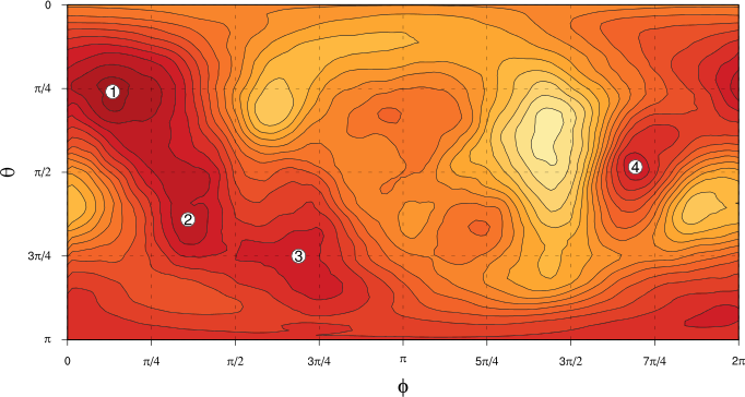
We can now see quite clearly that the distribution of spatial patterns of in space does appear to be non-uniform, with some preferred regions and some less preferred regions. In the next article but one, we’ll address the question of the statistical significance of these apparent “bumps” in the PDF, before we go on to look at what sort of flow regimes the preferred regions of space represent. (Four of the more prominent “bumps” are labelled in the figure for reference later on.)
Before that though, in the next article we’ll do some optimisation of the spherical PDF KDE code so that it’s fast enough to use for the sampling-based significance testing approach we’re going to follow.